Mastering Color in Quilting: Tips for Picking Fabrics That Speak to You
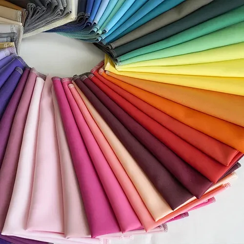
For many quilters, choosing the right colors is the first big struggle. The colors you pick can make or break your design, but how do you know what works? If you’ve ever had trouble matching fabrics, you are not alone.
In this post, we’ll break down the color basics and show you how to choose the fabric exactly what you need. Whether you are a beginner or looking to improve your skills, we’ll give you practical tips to help you make color choices that speak to you.
Understanding the Basics of the Color Wheel
The foundation of any color decision begins with understanding the color wheel.
Primary Colors: Red, blue and yellow form the base of all other colors.
Secondary Colors: Orange, green and purple are made by mixing 2 primary colors.
Tertiary Colors: Tertiary colors are mixing a primary color with a secondary color. There are 6 tertiary colors: Red-Orange, Yellow-Orange, Yellow-Green, Blue-Green, Blue-Violet and Red-Violet. These colors sit between primary and secondary colors on the color wheel and offer a wide range of hues for quilters to work with, giving your quilt a more layered and interesting look.
With this basic knowledge, you’ll be able to make better choices for your quilt’s color scheme.
Color Schemes: How to Choose Harmonious Combinations
When choosing colors for your quilt, here are a few color schemes to consider:
Monochromatic: Use 1 single color for a simple, elegant look.
Analogous: Choose colors that are next to each other on the color wheel, such as blue and green, to create a soft, coordinated design.
Complementary: Pair contrasting colors like red and green together to create a sharp contrast and energy.
Triadic: Select 3 evenly spaced colors (red, yellow and blue) for a balanced, dynamic design.
The Importance of Contrast and Value
In addition to choosing the right colors, it’s also essential to think about contrast and value
Contrast: High contrast (light vs dark) can make your quilt more striking, while low contrast creates a softer, more subtle effect. For example, a black and white quilt is a classic example of high contrast. Low contrast designs, on the other hand, use colors that are closer in value, creating a softer effect.
Value: Value refers to how light or dark a color is. Quilts with a variety of values (light, medium and dark) are often more visually interesting and dynamic. By mixing different values, you can create depth and make your quilt feel more layered.
The Role of Fabric Types
Different fabric types can impact the way colors look and feel in your quilt. Fabric texture, sheen and weight will also influence the overall look of the quilt.
Solid Fabrics: Offer clean, modern lines and make designs pop without distraction.
Printed Fabrics: Add texture and complexity to your quilt, but can be overwhelming if used too much. Find a balance with solids to avoid clutter.
Choosing Fabrics to Complement Your Color Choices
Different fabric textures can also affect the final look of your quilt.
Cotton/Linen: Soft and matte, these fabrics absorb light, giving colors a muted, subtle look.
Best For: Everyday quilts, soft and natural color schemes.
Silk/Satin: Reflect light, making colors appear vibrant and rich.
Best For: Elegant quilts, adding a touch of color or shine.
Flannel: Soft, brushed and cozy, flannel fabrics provide warmth and comfort. The heavier weight and softness make them ideal for cooler climates.
Best For: Warm, cuddly quilts, especially for winter or baby quilts.
Velvet: Soft and luxurious, its smooth, glossy texture adds elegance and warmth to your quilts, enhancing both comfort and style.
Best For: High-contrast designs for an elegant statement quilt.
Denim: Durable and sturdy, denim gives quilts a relaxed, casual look. It has a natural, rugged texture that adds visual interest to your designs.
Best For: Modern, casual quilts with a touch of rustic charm.
Conclusion: Let Colors Guide Your Creativity
Choosing the right colors for your quilt may seem challenging at first, but with a basic understanding of color theory and a little practice, it can become an exciting part of your creative process. Remember, color can transform a simple quilt into something extraordinary. Whether you prefer monochromatic designs or bold complementary contrasts, experimenting with different colors will help you find your own unique style.
At FactoTex, we offer a wide range of fabrics to bring your quilt visions to life. So don’t be afraid to experiment with colors and mix textures. Your quilt is a personal expression of your creativity, and with the right colors, it will truly speak to you.

Working With Facto Textile
We promise you:
- A wide variety of high- quality fabrics
- Full range of customized services
- Professional production technology
- Sincere Cooperation
Contact Us To Start Your Fabric Project
Please send us your message, we will reply within 20 hours.
Facto Tex
Product & Service
Contact Us
No.888 ZhuJiaWan Street, Gusu District, Suzhou City, Jiangsu Province, China
